Graphic Designs
PRODUCT LOGO
 On the right side of the page is our product logo which reads micro-fridge. For this graphic we were to make a word mark for the product we made. The dimensions of this graphic were about 8 inches by 12 inches, horizontal. The colors that my team and I agreed on for the product logo were lime green, white, and a some black. When designing the typography I decided on having both serif and sans-serif fonts. The "i" in micro is the symbol or icon for our product. The logo's icon establishes a "preview" of our product, being a microwave and a fridge, shown in the "i" in micro. The design of the typography was thought out very well the "Micro" in the word is much smaller in the design than the word "Fridge". I did this because the meaning of the word Micro means small, which is why I thought that it would look more professional for the two words to be different sizes to show contrast as well as balance.
 COMPANY LOGO
The graphic below is our company logo, Baca. The dimensions of the company logo were 8 inches by 12 inches, horizontal. The colors that were used on the product logo were the same colors, lime green, white, and black, we decided to use on the company logo to keep continuity among our graphic designs. The typography of ACA are filled in lime green and outlined in black. The "B" is the icon in the graphic and is in 3D rather than 2D like the rest of the letters in the design. The "B" looks like a fridge or a micro-fridge but it can represent multiple different appliances that the BACA company in the future could potentially produce.

COUPON
 The graphic to the left of the page is the coupon The dimensions of the coupon was 5 inches by 5 inches, vertical. The colors used in this graphic were lime green, white, and black. The difference of this graphic from the logos is that there is more black used to make up some of the typography as well as making up the border. When designing the coupon we knew had to show our icon in some way, along with what the coupon was offering to save for the buyer. The icon was placed in the center of the coupon to display the product. At the top of the coupon 20% off is the largest and colorful typography in this graphic. It is colored in the lime green and outlined faintly in black, this draws the eye. Then after the 20% off catches the eye of a person that person will want to want to learn more. So as they eye travels down the graphic the person will see the Icon and will be more intrigued. This now leads to the typography at the bottom of the coupon. The typography is small but in black bold letters. The thin, faint, lines border the edge border of the white space. Finally, the graphic is finished off with a thick, black, border to out line the coupon.
 WEB BANNER
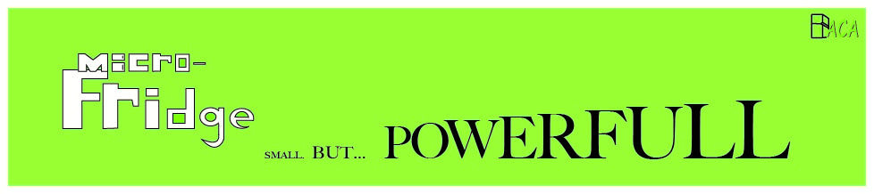
The graphic below is the web banner. The dimensions for the web banner are 960 pixels by 200 pixels. The colors that were used were lime green, light lime green, white, and black. When I was designing this web banner the first step I took was to copy over the company and product logos to the blank web banner. Once they were copied over I started experimenting with the different sizes and different placements of the logos. Once I decided on were I wanted to place and size the two logos. Next, I typed out our slogan, "Small But Powerfull ". I started to mess around with the different styles of fonts and word sizes. My teacher had looked at what I first had came up with that was the slogan in the middle of the page and the letters to spell Powerfull were flouting around in a curve like pattern. My teacher offered up the idea of having the slogan moved to the bottom of the banner and make Small" smaller than "But" and make each letter in "Powerfull" increase in height, each letter a little taller than the last. The slogans typography was colored black. The background was then colored light lime green so that it wouldn't blend into to ACA in the company logo.

ADVERTISEMENT

The graphic on the left is the Ad. The dimensions for the ad is 5 inches by 5 inches. The colors used for the Ad were lime green, white, and black. The first step to making this graphic was to copy over the company and product logos to the blank Ad. Next the product logo was placed were we wanted to to be. Then we used a line from our commerce, "Tired of your food getting warm or cold when you don't want it to?" We placed that line under the product logo and made the typography text color black. Next we picked the line,"stick it in the Micro- Fridge" and placed that under the last line. We made this line a little bigger. Lastly under every thing we put "created by" in small typography and then had the company logo after the "created by: ".
Overview
I designed the product logo and the web banner. I also helped pitch ideas for the company logo and the coupon. I like all of the work that I did. I think all of my work came out very good. My team worked pretty good and successfully together. However there was some miner problems communication wise when it came to some changes one person did to a graphic and didn't discus it with the group. The face on the Microwave portion of the Micro-fridge needs to be talked about what we will do with it when animating.