Thursday, May 24, 2018

Exploring Graphic Design Semester 2 Reflection

Exploring Graphic Design Reflection

What did you do this Semester?

Art History Dada 

What was the project?
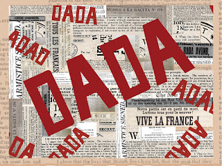
This project was in three parts. First everyone on my class had to pick out a paper from a bucket that had an art movement or person. I got the art movement Dada or Dadaism. Part one of this project was to research the topic we got and write a paper over it. Part 2 used the information I gathered to create a presentation that resembled the style of Dada.  On the right side of the screen is the first slide to my presentation. The third and final part of this project was to  design pretend posters for the Nelson Akins Art Gallery. These posters were to represent Dada. My final poster is the poster you can see below. 
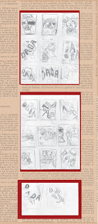
 
    This project took about the nine weeks to finish. My school had our server crash when I was in the middle of working on my presentation. Unfortunately the school could not get the presentation back. However I had a partially completed pdf of the presentation that I had sent to my self to practice. I was able to put the slides into Adobe illustrator and work with what I had. I learned that from this project that I need to back projects up on google drive or put a copy of the project o the desk top. I also learned lots about the art movement that was Dada. I was told that during my presentation I Sid "um" a little to much but I spoke loud and well thought out. My teacher also said she liked my sketches for the poster ideas. If I ever had to do this project again I would like to do more research into Dada becauseI only scraped the top of the iceberg. I love how my project turned out however I wish it had not taken so long to finish.You can see my full project here at:https://www.behance.net/gallery/62926435/Art-History-DADA  


        Typography Quotes

        I first had to do resurech over typography of this project and my blog over typography can be seen here: https://briannascott1.blogspot.com/search/label/GraphicDesignSq4Typography  After I learned how typography works I could start the project. the first  part was to find four inspirational quotes. Then using my knowledge on typography I found fonts that I felt go with each quote.The quotes I used were "Life is a ticket to the greatest show on earth"," All you need is a bit of faith trust and pixie dust", " All grownups were once children but very few remember it..", and "Some people are worth melting for." I planned the designs out. After I planed the designs I made all back designs in Illustrator. Once the all black designs were finished I added color and the photo below is the final product. This project took about three weeks to finish. I had some troubles with finding out how to place the quotes. I learned how typography is designed. I also learned that typography can inspire people.  I was told that my mock ups were well put together. I would not change anything for this project. The design process was pretty good and I loved how the final produced can out. You can see the full project here:https://www.behance.net/gallery/64314649/Typography-Quotes-project


        Rebranding 

        This project was to rebrand a small business or company that had a not to good logo. 
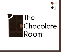
        This project took about three weeks. I had chosen "The chocolate room" to rebrand. "The Chocolate room is warm, relaxing, and welcoming. I wanted to put  all of these  components into the rebranding of the logo. I had to do 30 sketches. Then I had design three in illustrator. Finally I had to pick one logo design.  This project took about three weeks. It was hard for me to come up with new logo designs after the 20th sketch. I learned that it is very difficult to make a logo and rebrand businesses. I was told my color concepts were wonderful. I would probably want to look at different logo designs some more. The design process was pretty good and I liked the way my logo came out.  You can see the full project at :https://www.behance.net/gallery/65773485/Rebranding-Project


            How have you used your time in class?What do you do outside of class to enhance your work as a graphic designer or to better your projects? 

            I used my time very efficiently in class. I used my time in class very well. I stayed on track and if I didn't finish something I wanted to get done in class I would stay after to finish what I needed to get done so that I would not get behind. I also stayed after to make the covers for each graphic project on bechance to make them look nice. I have very good patients to sit down and focus on a graphic for a long time. I also love to be creative that helps me when I need to design a graphic. I need to keep a more constant style on bechance. 

            What are your areas of strength as an employee or graphic designer? What needs work?

            I am very creative and my work ethic would make me a good employee and graphic designer. I need to have more practice in using Adobe illustrator. 

            Summary

            My favorite project was the Typography quotes project. I would not change anything about this semester. I will take my skills in Illustrator and over typography and apply them to future projects.  I will work more efficiently in Illustrator. I had lots of fun this semester and I can't wha till next year.


            Tuesday, May 22, 2018

            Exploring Animation Reflection

            Exploring Animation Reflection

            Through out this past sophomore year I have learned many new skills in Exploring Animation.

            Technology

            I learned how to use the Adobe program After Effects. My Animation teacher introduced After Effects to me. I learned how to use after effects from tutorials on Youtube as well. This program is were almost every single project I did this year was made. When I first was introduced to After Effects I had some difficulties navigating and using the tools.  After some practice using after effects, I can navigate this program much better.  I also learned how to use a new 3D program called MAYA. Mr. Nuterville, the other animation at my school. taught my class who to use Maya. I also learned how to Maya from instruction documents I received from my animation teacher. Maya was not that hard to learn the basics of, however the program some times crashed during a project and  it was a pain to get the program to open back up. The video shown below was one of my favorite projects made in Maya.


            Project Management 

            My project management skills were much better than last year. During the middle of the year when I was introduced to Maya and we started to get lots of small projects. I started to fall behind and had to come in  after school to catch up with the class. I learned my project management skills from my many teachers over the years and from my parents. Project Management skills are important to have so that you don't get pealed up with late assignments.


            Collaboration and Communication 

            This year I feel as if I improved on my collaboration and communication with others. The last project for my sophomore animation class was based on the collaboration of a team to produce an animation. The animation incorporated special effects , 3D animation, and real life film. I was able to communicate well with my group because I was able to chose the people in my group. Being able to communicate and work well with my group allowed us to  use our time efficiently and produce a successful video.


            Leadership

            Throughout the year I have helped other people navigate the different programs. I also helped lead the production of the final project. Leadership is important for future jobs and projects. It is challenging of we to lead large groups of people.

            What are your greatest strengths/what are your weaknesses?

            I am good at being creative and organized. I like making a plan before starting anything. Once the project is planed out I can start the project and put my creative spin to the outline if there is one. 
            I can work on my skills in using photoshop and after effect can be improved with more practice.


            What are you going to do with what You have learned?Is there anything you would change? Why?

            I am going to use what I have learned  for any of my future projects. I will also carry over what I have learned in this animation class to Animation my junior year.  I would have liked to do more projects with photoshop and 2D animation because I love drawin people.

            Summery

            I loved  the last animation project animation. I can not what to improve my skills more in animation next year. I cannot wait for Animation class next year. 


            Monday, April 16, 2018

            Marks and Symbols

            Marks and Symbols


                 Marks and Symbols are very important to Graphic Designers. It is very important for Graphic Designers to know the diverse spectrum of marks that are available to help them solve visual  problems. The basic knowledge of marks will also help the graphic designer know how to put multiple "positive" marks together without creating confusion for the public eye. It is very important to note that even if two marks have positive features, when putting them together does not always look right. There are six basic ways to classify marks;  Pictographs, letter marks, logos, combination marks, trade marks, and symbols. Pictographs are seen everyday were ever you go, they are symbols used to replace words. Anyone, can understand a well designed pictograph like the sign for the bathroom, which is an international sign. However, Pictographs can cause cultural confusion with the use of corporate marks. Letter marks are used to identify a company. These marks are abbreviated company names and are easier to read. Logos are like letter marks but they are not abbreviated. Logos are used to identify  brands, projects, a group, and companies. Logos can be legally protected.  A combination mark, or a signature, is a logo and a symbol put together. Combination marks are good for labeling effectively, as well as being unique. However, combination marks can be very complex and redundant. Trademarks are legal names for unique marks, they protect the marks from getting stolen or copied. Trademarks are protected by the law and can be sold if the creator wants to sell it. Symbols a  type of mark that does not use type to identify a corporation, brand, an institution, or an agency. Using a symbol in a design creates an unique, quick, and simple impact. The downside to using symbols is that it can be costly to promote and can sometimes cause confusion.             


             Pictograph Examples:                                                         
                                                                                                                   corporate marks
                                                                    
            Image result for corporate marks


            Letter marks example:


            Logos:     


            What is the difference between a symbol and a logo? What is it called when these two things are used together?


                 Logos use type and words to establish a brand, company, or group. However, symbols do not use any words or type. Logos can use two or three colors.  symbols usually use only one color. When you put a symbol and a logo together it is a combination mark that is also called a signature.     


            Combanation mark:


            Three key facts and why they are important? 

                 The first key fact is that negative spaces are necessary when you are designing a symbol. Having negative spaces or white spaces. The second key fact that I think is very importent is metering and color is good. Less is more is very importent to keep in mind when designing symboles because when you limit vocabulary and unnessesary lines you can get a nice clean simple design, having only one color can help with this too. The last key fact has to be combanation marks. When using a combanation of a logo and a symbole, it creates an effective, unique lable. 


            What was your favorite thing you learned and why will it be valuable in the future?

                 My favorite thing I learned has to be the combination marks, the combining of logos and symbols together.This will help me,when I have any future branding projects.    


            General thoughts & conclusions.


                 I cannot wait to apply this new found knowledge over marks and symbols, to future projects. I will use the tips to making "good symbols". The tip that involves using negative spaces will be helpful with future branding projects. 

            Thursday, April 12, 2018

            Sq4:Ball Bounce Animation

            Ball Bounce Animation


            Summery


            For this animation I was assigned to model a Tennis ball, a Golf ball, and a Bowling Ball in Maya. The first step was to film a real life Tennis ball, Golf ball, and Bowling ball, each dropping from 5 feet in the air. Once all three of the balls were filmed, I loaded the videos onto my computer. Next using photoshop, I marked the frame number each time the balls hit the ground and the highest points were they bounced back up to. I recorded all of my data into an excel spread sheet and got started with the modeling process in Maya. The balls were all spheres with the appropriate bump mating needed on each one.  Once the Tennis ball, Golf ball, and Bowling ball all were finished, I started animating them in the timeline. I looked at the excel sheet and at the frames listed I set a key frame at the right height. Once all of the key frames were set I went into the graph editor and edited the graph so that the models would not ease in and ease out. Next I made a poly plane under the balls. I added three spot lights;the key light, the fill light, and the back light. Finally I had the lights were I wanted them to be I added a background image to use as background.       


            What did I learn?

            I learned now to add an image to the background in Maya. I also learned how to edit the graph editor.


            Conclusion 

            I enjoyed making this animation so much. I can not wait to use what I learned in future projects.   

            Saturday, March 31, 2018

            Sq4:Can of Marmalade Animation


            Can of Marmalade Animation


            The can animation was divided into 2 parts. The first part of the project was to make a label for the can. I sketched my ideas for what i wanted my label to look like. After I settled on the sketch design i liked the most, I used photo shop to color and digitized the sketch. After the label was finished in photoshop I saved it as a jpeg. Now on to part two, I made a can in Maya using the CV curves tool. Once I finished making the model of the can, I selected the faces I wanted the label to be on. Then I added a Lambert, file, and my label. I selected the top of the can and I added a blinn. The rest of the parts of the can are just a pong E with the transparency turned down.  I then I made marmalade by manipulating a cylinder and added an orange phong with a cloud texture. Finally I added a background, a floor, and three lights.        


            Wednesday, March 21, 2018

            Typography

            Typoegraphy 


            Typography is an art form that uses type to convey a message through the style, font, size, spacing, and color. After watching the video series on Typography, I learned that the font of a word can effect the five senses. In one of the videos there was a TED speaker who was talking about the effects of typography. One of the effects the speaker talked about was, she had ran a small experiment. In the experiment the people involved were given a jellybean to eat and were told to look at the word "eat" in a more smooth and simple font. She then had the group eat another jellybean but the font they had to look at still said "eat". However, the font of the word this time had very sharp corners and very aggressive like. The people said that the first jellybean tasted sweeter and the second jellybean had tasted more sour. The videos also taught me the importance of  hierarchy. When using hierarchy in a design there is always primary and secondary type. The primary type is the boldest or the most eye catching, this is what you what your audience to see first. The primary type can be a name of a company, what you are selling, or an important word.  The secondary type is normally a simpler font. Secondary type is always smaller than the primary type.There are many types of type thiknesses inside a font families. I learned that type can be "a mater of life or death," this is like type on road signs and warning signs. Type is all over the place in posters, trafic signs, logos, names, and many other places.   

            What was the biggest take away from the videos for you personally

            I personally will use the rules of hierarchy in future projects. I will also try to start practicing how to convey different messages, through different fonts, spacing, and weight, when doing any type of branding or title pages in any future projects.            


            Summarized what you learned from the article 


            After reading the article, the 10 Golden Rules You should live by when combining fonts, I learned ten very impotent typography rules: choose complementary fonts, establish a visual hierarchy, consider context, mix serifs and sans serifs, create contrast, steer clear of conflict, avoid pairing fonts that are too similar, use fonts from the same family, limit your number of fonts, and practice. I learned that different fonts have different moods and personalities like elegant, fun, playful, sad, or serious. I also learned that it is good to mix a word or phrase that has a large,creative, and wavy font, with a word or phrase with a more San-serif font, this creates great balance within the graphic. I learned that primary and secondary font plays a role in astablish a visual hierarchy. Another thing I learned from the artical was that you should think about the mood and voice of the text you want to relay to people.  


            San Serif   
            Image result for san serif font


              Serif :
            Image result for serif font


            Discuss three key points you learned and why they are important in typography 

            One of the key points of typography I learned, was how to establish visual hierarchy when using typography on things like  newspapers, bottles, or magazines. According to the 10 Golden Rules You should live by when combining fonts,  when establishing a visual hierarchy adding or subtracting "weight" from letters/words to allow the eye to navigate the design smoothly. Another key point is choosing complementary fonts. Choosing complmary fonts is important in typography because it helps give different moods or personalities to fonts in a graphic to deliver the right massage you want. Createing contrast is also a very big key point in typography. To create contrast is important in typography to distinguish what is needed to be seen first or second and how the diffrence between the fonts size is on the graphic.   


              What was you favorite thing you read and why will it be valuable in the future


            My favorite thing to read about typography was the rule on how to limit your number of fonts. This will be helpful for me to remember in future projects to make them look more organized and easy to read. This will be valuable for me in the future when I have to design any posters for any future projects. The rule of limiting fonts will also help me think more critically when I am designing a graphic that includes type.         


            General thoughts and conclusions


            I cannot wait to apply what I learned, from the videos and the article, to future projects. The information about what hierarchy is, has helped me a lot to clear up what it was and I will definitely apply it to my future projects.   


            Friday, March 2, 2018

            Sq3: Snowflake Animation


            Snowflake Animation 


            This Animation process taught me how to set key frames in Maya for each snowflake. I also learned how to make the snowflakes turn as they fall by rotating in diffrent directions. Then after every difrent rotation I added a keyframe. I also learned how to make snowflakes using the create polygon tool. Then I mirrored and duplicated the polygon. I then used the extrude tool to make the snowflake pop. I also learned how to make a window by just extruding it.